
Web Accessibility Project Write Up
So this page is kind of meant to organize my own thoughts on how I made this site from start to finish. I found myself watching tutorial after tutorial on basic HTML, CSS, JavaScript, React, shadCDN, NodeJS, and a million other silly names that sound made up. I didn't want to just keep watching videos though or taking Udacity courses. I wanted to make something! So I made this site, learned from my shortcomings, and improved this site from the lessons I learned.
For my "tech stack" I use VSCode, push to my Github Repo, and then that repo syncs with an Azure static Web App. I'm also using TailWind, more specifically Tailblocks, to build the majority of the site. In short, write the code in VSCode, test in a local server (to make sure it makes sense and also to run my accessibility stuff against it), then push to the repo, which syncs with the static web app. In short, I would:
- Write the code in VSCode
- Push to my Github repo
- The Github repo automatically syncs with my Azure static web app.
This was a great way to get started, but as you can imagine there were some issues. To start, the Tailblocks code was not very accessible. Running WAVE, ANDI, Axe, or any other tool revealed a ton of short comings. Some were easy to fix, others were a bit trickier (which makes for great practice!). I have a couple of pics of what a default page looks like below:
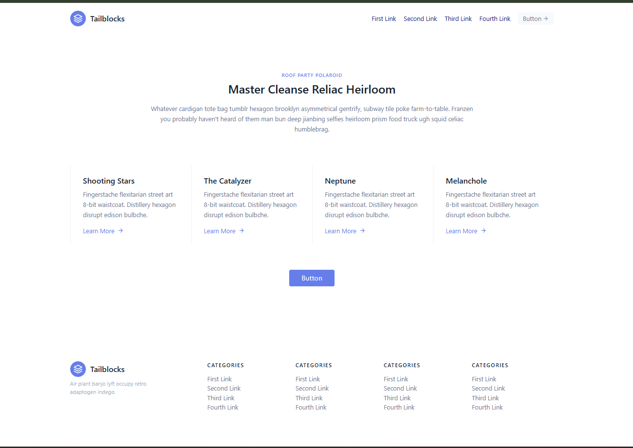 "Boring, generic, but an actual site!"
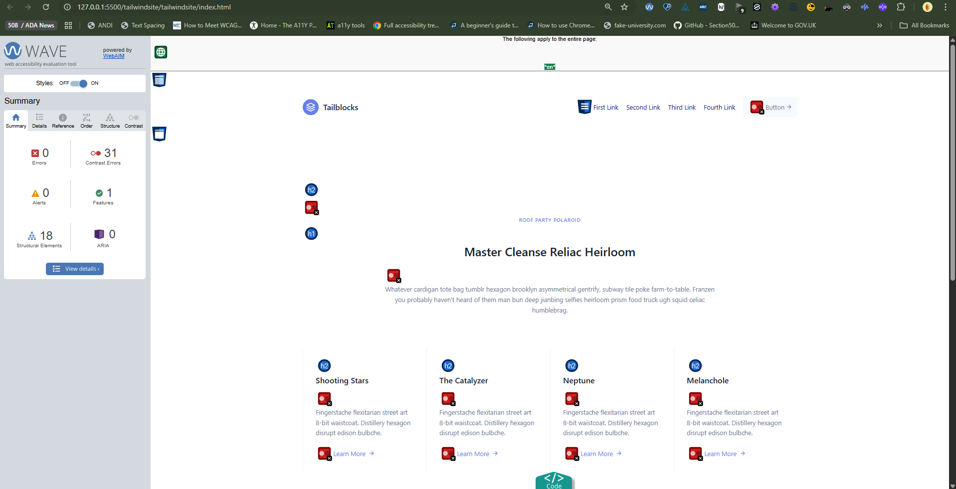 "The same site, but now tested with WAVE."
So the initial page that you can make with Tailblocks has no accessibilly errors according to WAVE. Which is great! But this is also a great example on WHY we do manual evaluations as well. Some of the things that WAVE (and some other tools) missed include:
- Hover focus
- Skipped links
- Tab order
- Skip link
Some other things that it doesn't have are: accessibility statement (coming soon), form to let folks know about issues they run into (I need to learn more about how to make forms), consistent navigation (WCAG 3.2.3), double checking 200% magnification, using Ems instead of Pxs for font size (Shout out Coder Coder for this video explaining the differences). There are many more things that would need to be fixed up, and probably even more things I haven't even spotted.
So let's take care of the easiest but most impactful things first. For me this was changing the color contrast in the CSS file, particularly for links and P tags. The default classes for text in Tailblocks are for some reason grey, a very light version of grey. I changed that so it is #ffffff hex color (black) on a white background. Much more accessible! But now we need to make the links stand out. The color contrast for links was also terrible, and I wanted to make them a bit easier to spot. I hopped into the CSS file, made the color darker and bolder, and I put an underline to make links easier to spot. I also put an effect on hover for links though, that removes the underline, and also change the color of th link. Making the links easy to find is one thing, but actually making it so users KNOW they can be clicked on and interacted with is another. Adding an underline, and a hover focus effect made the links for all the pages now much easier to spot.
There is more that I changed, but for now I wanted to just make this page not blank. I will add more to this section soon 🙂